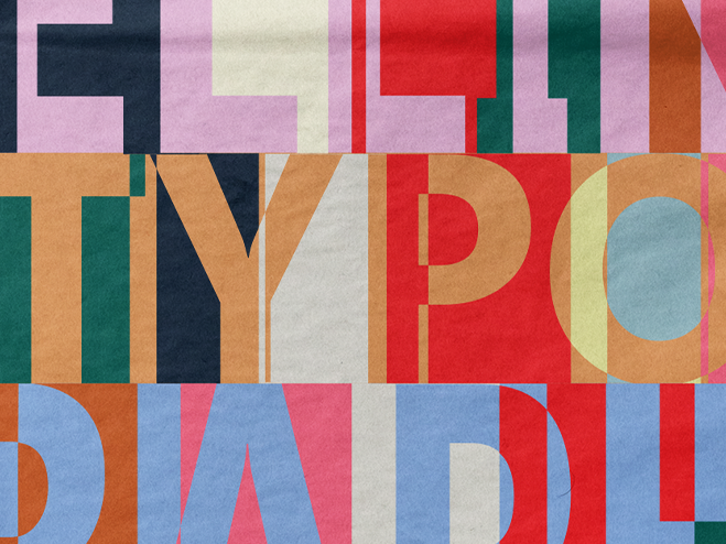
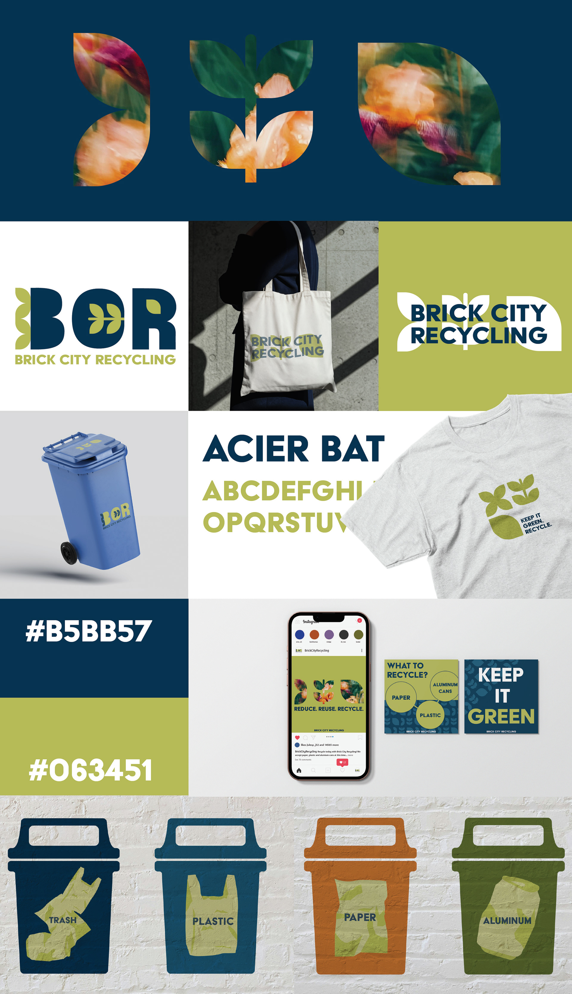
A rebrand was needed for my art department's recycling program. I wanted to show something simple that represented not only recycling and sustainability but also all of the art students that go into the building everyday. You want where you throw your redbull cans to be aesthetically pleasing. I started this simple leaf design and repeated it over and over weaving it into the bold type. This leaf represents the goal of the recycling program: sustainability made simple. The tagline “keep it green” also keeps it simple while leaving it open to interpretation of the recycler.