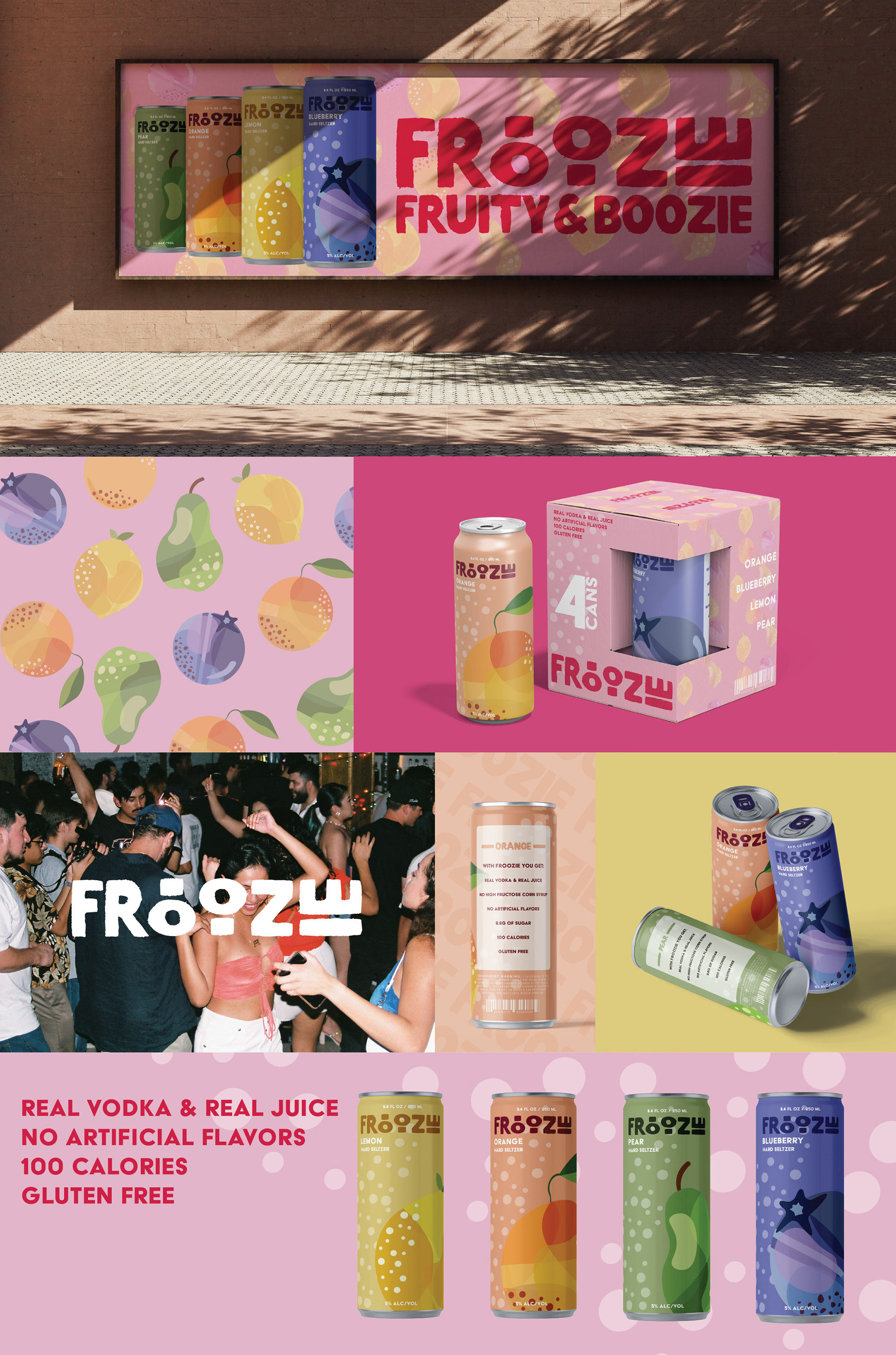
Froozie was built around the fruit illustrations and used them as a reference for the color pallets and playfulness of the brand. Using bold type and bold colors to catch your eye. The logo meant to represent a fat marker you’d use in grade school. Froozie is there to remind adults that we can have fun and play too.